gcsescience.com 14 gcsescience.com
How to Present Data - Line Graph.
There are a number of different ways of presenting data.
When both the independent variable and the dependent
variable
are continuous, then the data is best shown as a
line graph.
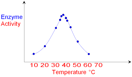
Below is a line graph showing
enzyme activity plotted against
temperature. Temperature is the independent
variable.
The independent variable
is always plotted on the X axis of a graph.
Note the increased number of
points plotted closer
together
between 35 and 45 °C
where the graph changes shape (continued).
Other forms of data can be presented as a bar chart or a scattergram.
![]() Links
How Science Works
Revision Questions
Links
How Science Works
Revision Questions
![]()
gcsescience.com Chemistry Index Physics Index gcsescience.com
Home GCSE Chemistry GCSE Physics
Copyright © 2015 gcsescience.com. All Rights Reserved.