gcsescience.com 13 gcsescience.com
How to Present Data - Bar Chart.
There are a number of different ways of presenting data.
When the independent variable is categoric
and the dependent variable is
continuous
then the data can be shown as a bar
chart.
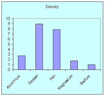
Below is a bar chart showing the relative density of different metals.
Other forms of data can be presented as a line graph or a scattergram.
![]() Links
How Science Works
Revision Questions
Links
How Science Works
Revision Questions
![]()
gcsescience.com Chemistry Index Physics Index gcsescience.com
Home GCSE Chemistry GCSE Physics
Copyright © 2015 gcsescience.com. All Rights Reserved.