gcsescience.com 16 gcsescience.com
How to Present Data - Line Graph - Scattergram.
There are a number of different ways of presenting data.
When both the independent variable and the dependent
variable
are continuous, then the data is best shown as a
line graph.
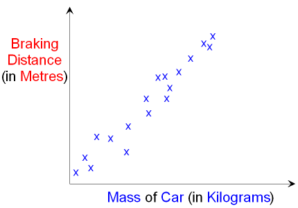
A graph showing the individual
points of one variable
plotted against the other variable is called a scattergram.
For example, the graph below shows
a scattergram
of the mass of a car plotted against its braking
distance.
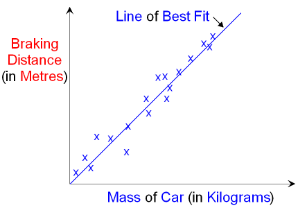
A line of best fit can
show the relationship between the variables.
In this case the relationship is directly proportional.
Other forms of data can be presented as a bar chart.
![]() Links
How Science Works
Revision Questions
Links
How Science Works
Revision Questions
![]()
gcsescience.com Chemistry Index Physics Index gcsescience.com
Home GCSE Chemistry GCSE Physics
Copyright © 2015 gcsescience.com. All Rights Reserved.